


BRANDING
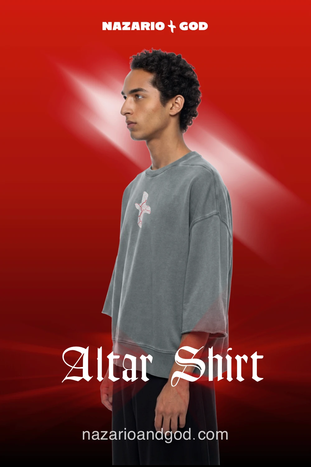
Brand identity, art direction, and campaign design for an independent spiritual streetwear label.
BRANDING
Brand identity, art direction, and campaign design for an independent spiritual streetwear label.

BRANDING
Brand identity, art direction, and campaign design for an independent spiritual streetwear label.
The Concept
The Concept
Spiritual Architecture
Spiritual Architecture
Faith doesn't need a building to have structure. It needs intention.
Nazario + God treats spirituality the way an architect treats space — not decoration, but framework. The cross at the center of the identity isn't religious iconography; it's a symbol older than any one faith, used here to mean alignment: where you are, and where you're headed.
Every design decision — typography, color, garment language — was built to hold that idea without saying it outright. The brand had to feel like conviction, not messaging.
Faith doesn’t need a building to have structure. It needs intention.
Nazario + God treats spirituality the way an architect treats space — not decoration, but framework. The cross at the center of the identity isn’t religious iconography; it’s a symbol older than any one faith, used here to mean alignment: where you are, and where you’re headed.
Every design decision — typography, color, garment language — was built to hold that idea without saying it outright. The brand had to feel like conviction, not messaging.
The Context
The Context
A generation searching for structure
A generation searching for structure
Interest in spirituality is rising fastest among the people least interested in organized religion. That gap, believing without belonging, shaped who this brand speaks to and how.
Interest in spirituality is rising fastest among the people least interested in organized religion. That gap, believing without belonging, shaped who this brand speaks to and how.
27%
of U.S. adults now identify as spiritual but not religious — up 8 points in five years.
(Pew Research Center)
of U.S. adults now identify as spiritual but not religious — up 8 points in five years.
(Pew Research Center)
+70%
of adults born 2000–2006 believe in something beyond the natural world, even as most rarely attend religious services.
(Pew Research Center)
of adults born 2000–2006 believe in something beyond the natural world, even as most rarely attend religious services.
(Pew Research Center)
Brand Evolution
Brand Evolution
Creating the Wordmark
Creating the Wordmark
The mark went through several typographic directions before landing on Blackletter - the one style with enough weight to carry conviction, not just streetwear.
The mark went through several typographic directions before landing on Blackletter - the one style with enough weight to carry conviction, not just streetwear.
The mark went through several typographic directions before landing on Blackletter - the one style with enough weight to carry conviction, not just streetwear.
2025
2025
2025


Early explorations leaned on precision- clean geometry, angular symmetry, a cross that read as engineered rather than felt. It looked correct, but it didn't carry weight.
Early explorations leaned on precision- clean geometry, angular symmetry, a cross that read as engineered rather than felt. It looked correct, but it didn’t carry weight.
2026
2026


Streetwear specifically has moved toward this "curated chaos" - intentionally imperfect marks, distressed texture, an anti-corporate aesthetic that Gen Z audiences read as authentic rather than templated. The cross was redrawn with that in mind: hand-finished edges instead of mathematically perfect angles, a mark that looks made, not generated.
That shift toward imperfection ended up bringing the brand closer to its actual origin - my grandfather, Nazario, whose life was cut short in 1965. A perfect, engineered symbol couldn't hold that story. So the cross was drawn the way memory holds a place: imperfect, hand-marked, the same rough shape as the roadside cross once placed in his memory. Not a template. Not a corporate mark. Made by hand, just like that first one was.
The hand-designed cross became more than a design decision. It became a way of carrying him forward.
Streetwear specifically has moved toward this “curated chaos” - intentionally imperfect marks, distressed texture, an anti-corporate aesthetic that Gen Z audiences read as authentic rather than templated. The cross was redrawn with that in mind: hand-finished edges instead of mathematically perfect angles, a mark that looks made, not generated.
That shift toward imperfection ended up bringing the brand closer to its actual origin - my grandfather, Nazario, whose life was cut short in 1965. A perfect, engineered symbol couldn’t hold that story. So the cross was drawn the way memory holds a place: imperfect, hand-marked, the same rough shape as the roadside cross once placed in his memory. Not a template. Not a corporate mark. Made by hand, just like that first one was.
The hand-designed cross became more than a design decision. It became a way of carrying him forward.


© JS Interfaces LLC 2023 - 2026 All Rights Reserved
contact@jsinterfaces.com

© JS Interfaces LLC 2023 - 2026 All Rights Reserved
contact@jsinterfaces.com
© JS Interfaces LLC 2023 - 2026 All Rights Reserved
contact@jsinterfaces.com